How To
The Ultimate Guide to Beverage Packaging
You’ve created an amazing beverage. Everyone’s going to love it, and it’ll change the way people think about consuming liquids. But unless you plan on only selling it by the glass out of your own bar and/or soda fountain, you’re going to need some beverage packaging for that.
Your mind probably just jumped to bottle or can, right? That’s a good place to start, but there’s a lot more you’ll have to consider. Welcome to…
The Wonderful World of Packaging
Let’s start by examining the three layers of packaging. A bottle or can are what we call the “product packaging”. It’s what the drink actually comes in. Surrounding that is the “inner packaging”, which is what keeps the product secure. (In the case of cans, it might be plastic rings that hold a six-pack together.) And finally, we have the “outer packaging”, which is what the customer is most likely going to see first. This’ll be the box or case that your drink comes in.
This is, of course, a very simplified rundown of what’s involved in packaging your beverage. Before you can even start worrying about packaging, you’ll have to consider some elementary, yet crucial questions about your beverage.
-
What is your beverage?
I warned you these were elementary questions. The packaging is more than just a presentation for your beverage. It’s a physical container that’s restricted by real-world properties. Is your drink carbonated? Does it need to remain under pressure? Does it need to be temperature controlled? Is it meant to be mixed with other liquids?
All of these will affect the logistical needs of the packaging.
-
Who is your customer?
Of course, everyone wants as large of a customer base as possible, but that’s not how marketing works. You need to figure out who you are target drinkers are. Men or women? Young or old? Connoisseurs or casuals?
And don’t forget there are legal restrictions on who you can market certain types of drinks to.
-
How are your customers going to buy the product?
Just as important as who is going to buy it, is how. Will they find your drink in retail stores? Bars? Movie theaters? By the bottle or by the case?
Once you’ve really drilled down on these questions (and don’t worry, you can have multiple answers to the same question), you can begin working on the actual design for your beverage packaging.
Need to Know
If this is your first beverage, then you’re probably designing the packaging from scratch. But if it’s part of an established brand or line, you’ll have to make sure it fits your brand aesthetic. Be sure to find your color values (either as CMYK or Pantone Matching Values), since those are needed for printing. Likewise, be sure to utilize your already-established font or fonts. And, of course, make sure you get a vector file of your logo, if possible.
Next, start creating all the content that’s specific to each layer of packaging. This will most likely include written copy as well as logos or brand marks. You may even want a photo on the outer packaging, if that fits your aesthetic.
Don’t forget you’ll need to leave space for legally-mandated marks, such as barcodes, nutrition information, and alchohol content. Furthermore, a lot of these—like batch numbers and expiration dates—change regularly. You’ll need to save space for a sticker or stamp to affix to each batch of drink you produce.
14
Your passion for your drink is free, but the packaging is not. You have to consider the cost of printing and manufacturing.
As alluded to above, not every instance of your drink package is going to be unique. There will be fixed costs (such as hiring designers), as well as per-item costs (labor, materials, as the already-mentioned stamps & stickers). Like any good drinkpreneur, you’d obviously like to keep costs down, but it doesn’t always pay to be frugal. Better materials make for a better presentation; a luxury drink could use some luxury packaging to stand out on the shelf.
The Fun Part: Let’s design some packaging!
The first step is to decide what kind of packaging do you want: Cans? Bottles? Some kind of space-age pouch? Do the bottles come in a case, or are they sold individually?
A unique shape to your bottle can be eye-catching, but it also creates logistical headaches when it comes to labels. You need to ensure there’s a flat, or at least regular curved, surface on which to print or affix labels.
Another thing to consider is how distinctive packaging elements costs are not just one-time, but cost you every time you manufacture the unique container. A 2 liter bottle may not be very original for a soda, but its standardized shape and size keeps the costs low.
Also bear in mind, your particular type of drink my require special lids or caps to preserve them. These will likely have a per-item cost dependant on the size of your run, but they’re also an opportunity to make your drink stand out from the crowd.
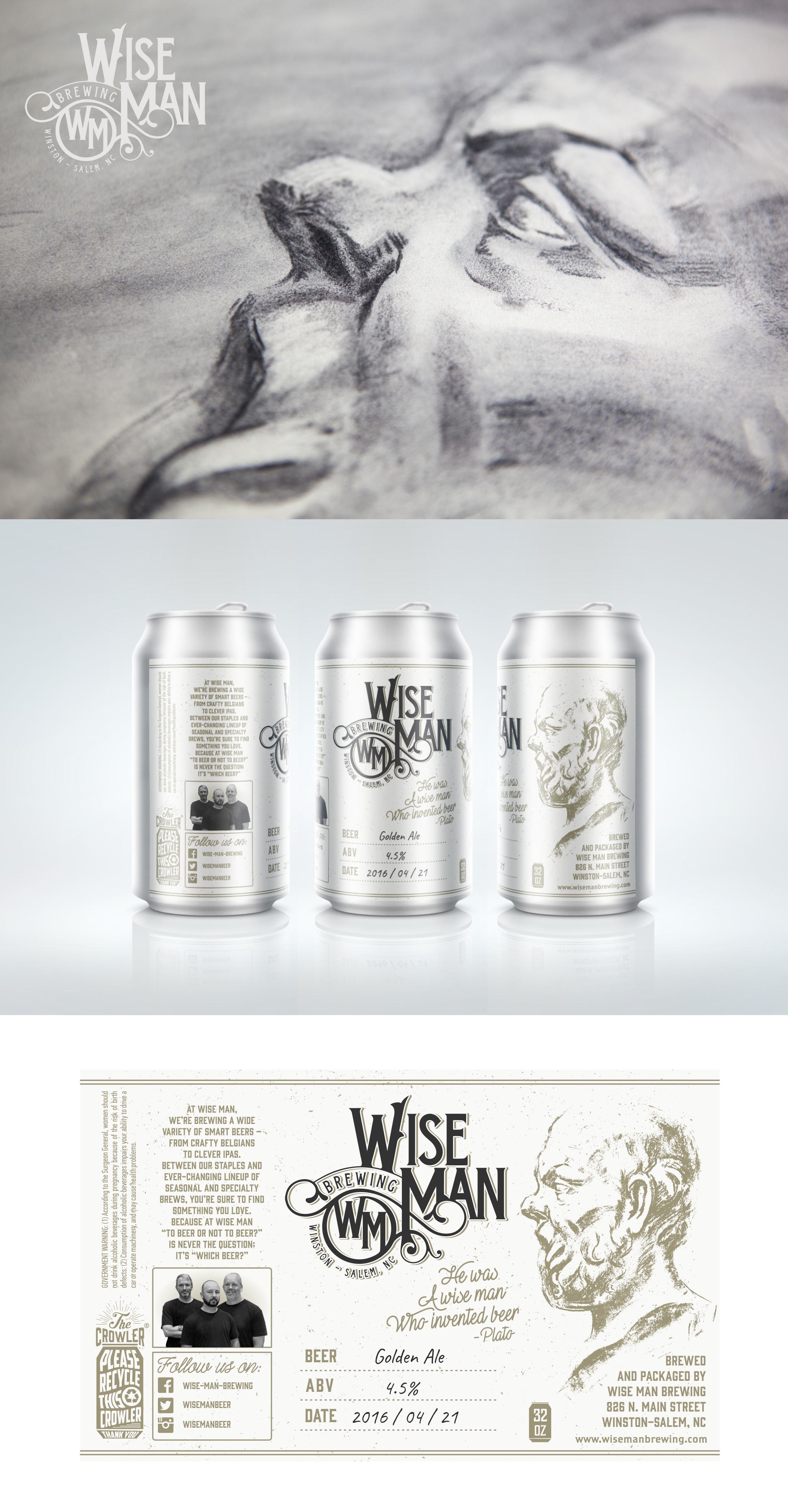
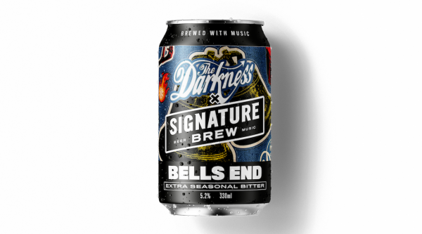
Even if your drink is a regular shape, like a beer can, keep in mind that this still affects your label. Some images may look great when they’re flat on your computer screen, but become distorted when curved on a convex surface.
It’s Dangerous to Go Alone!
While you’ve been busy concocting your amazing drink, it’s entirely possible you haven’t been studying graphic design at the same time. That’s okay! There are loads of amazing beverage packaging designers at 99designs ready to work with entrepreneurs just like you.
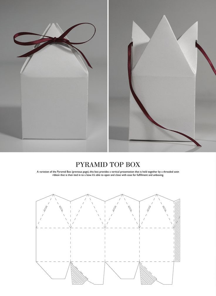
But don’t just focus on your designer. You’ll also want to make contact with a professional printer, too. You want your printer involved early in the process because they’ll have a number of requirements for your designer, including types of file formats, color options, dielines. Some of these are technical specifications you don’t need to worry about, but pay attention to the die lines, which are the flat representation of three dimensional packaging. This will help you understand what standard options exist for your type of packaging.
What’s Most Important to You?
You probably have a lot of thoughts and feelings surrounding your drink. It’s tasty, it’s healthy (maybe), it’s smooth, it sophisticated. But your customer is unlikely to take all of that in while browsing the liquor aisle at the supermarket. So what do you expect them to see?
You’ll need to work with your designer on what’s called “information architecture.” Arrange your key takeaways in order of importance. This will guide your packaging design. The centerpiece of your design should be the top of that list, whether that’s the brand name, or the logo, or something else entirely.
A Second Opinion
After you and your designer have been working on your packaging for a while, you might start to lose a little perspective. It’s hard to tell objectively if the design you came up with is really accomplishing your goals. This is perfectly normal, and just part of the process.
The next step is getting feedback. With as little fanfare and setup as possible, show your drink to a varied group of people who you consider a possible purchaser of your beverage. This can include employees, loved ones, neighbors, even strangers on the internet. Anyone who will give you an honest and relevant opinion.
No question is too basic. Ask them: What kind of drink is this? Who would want to drink it? Does the package reflect the drink itself? Does it stand out from competitors?
If their answers match your own, then congratulations! It’s time to go to the printer (following the delivery instructions you discussed earlier).
If there is a disparity, ask follow up questions to find out where your presentation diverged from their reception. Take these notes seriously, and discuss them with your designer. Going back to the drawing board isn’t a terrible thing; it’s just another step in the process. It would be much worse to run with a new package that doesn’t work, only to discover the problems after it’s already in the marketplace.

