How To
How To Brand A Beverage?
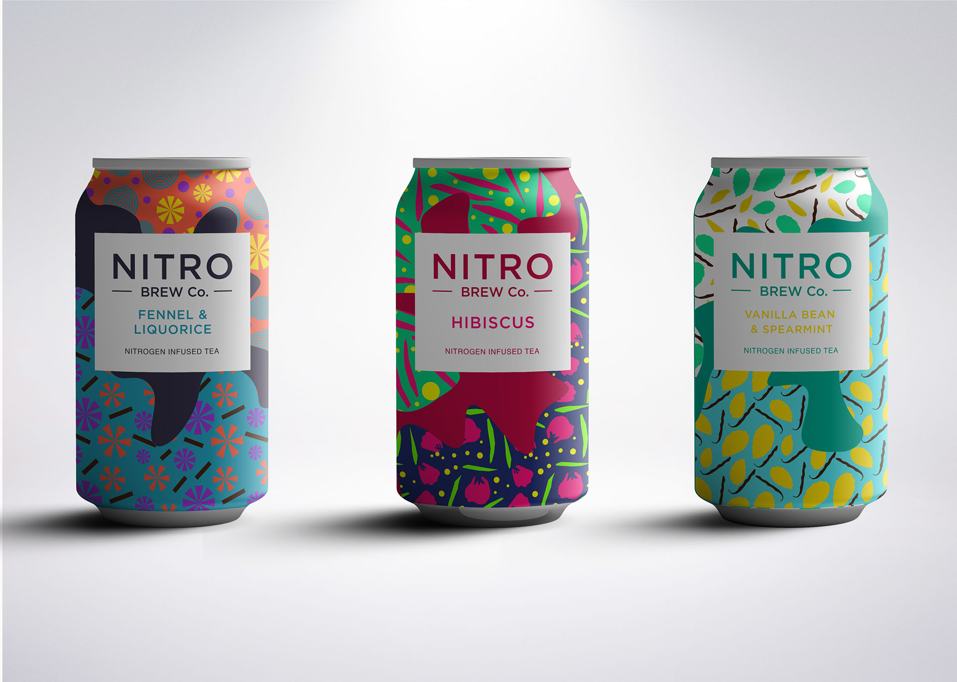 Branding is a hugely important aspect for any drink put on the shelf. For new products especially, people make judgments largely on relatable branding that they feel embodies their values and interests. And because food and drink trends come and go as often as seasons change, being memorable is key.
When choosing different design elements, like package shape, logo design, colors, and fonts, market research is necessary. Who is your intended demographic? What message are you expressing? What kind of designs are your competitors using?
The product itself also plays a key role in how the branding should be executed. What are the branding trends associated with different drinks and what do they mean? Alcohol, energy drinks, and cold-pressed juices are all branded differently. So what elements differ and why? Here are some of the ways big players in the industry have set market trends and how you can follow their lead.
Alcohol
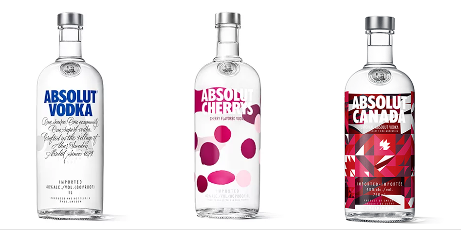
Absolut vodka is an excellent example of interesting alcohol branding. Their original bottle shape feels simple, yet closer inspection shows attention to details. There’s the neck ring, the embossed metal seal sunk into the glass itself, and the ultra-minimalist, yet perfectly brushed metal cap. The only colors used are black, white, and blue, which are associated with luxury, purity and reliability.
The font chosen for the name is in all-caps for strength, boldness, and confidence. The descriptive text is playful, sophisticated, and not confined to the line, implying a willingness to break some rules and have fun. Absolut is generally an inexpensive pick, but you wouldn’t know by the way the bottle looks and feels. The simplicity and accessibilty of the label communicates a vodka that everyone can enjoy, regardless of status.
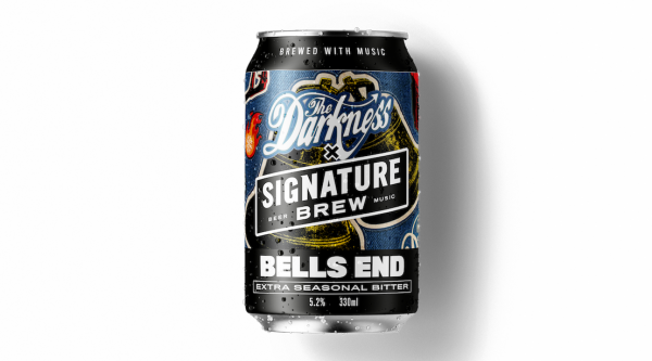
One way Absolut set themselves apart was through creating limited-edition bottles that made each bottle feel visually interesting, and even one-of-a-kind. Certain design elements have always been locked down, like the silver bottle cap, quality seal, and name font and size, but by inviting famous artists and designers from around the world to play on their canvas gave the brand it’s distinct association with uniqueness. This custom approach has been reproduced many times over, especially seen with the rising popularity of craft beers.
People generally love supporting things that seem conservatively risky, to feel like they are making a societally acceptable choice mixed with a bit of their uniqueness. Limited-edition styles create this impression without necessarily distancing a single bottle from the larger brand. Other popular examples of customized drinks can be found by looking at brands like Snapple (triva under every bottle cap), or Jones soda pop labels (different black and white photos on each). If you’re looking to access a more niche audience (or many niches), artistic is the way to go.
Energy Drinks
Energy drinks tend to follow a certain formula in their marketing. Bright, loud colors with bold fonts that are instantly recognizable dominate this industry. This formula works for a reason! Bright, bold colors tend to actually make us feel more energized just by association. The colors also work well when trying to get the attention of someone shopping for a drink in a convenience store.
Red Bull is a bit of a marketing marvel. The brand instantly has become one of the iconic energy drinks, and one half of the signature “jaegerbomb”. College students grab a Red Bull before heading both to the bar and the library. Clearly, their branding draws the young looking to fuel an adventurous life. The bright colors are definitely a part of it, but the font they’ve used is also unique, geometric, and modern.
The use of the bull, symbolically, is meaningful — a bull is powerful, strong, and a force to be reckoned with. A bull market is equated to success and financial abundance. These are the qualities we want energy drinks to empower us with. Another key branding choice was to sponsor extreme sports, whichi creates a distinct connection with peak human performance, and even that it’s good for you! No one ever forgets which drink will ‘give you wings’.
Take a page out of Red Bull’s book if you’re marketing an energy drink. Stick to bold colors, interesting fonts, and powerful symbolism.
Cold-Pressed Juice
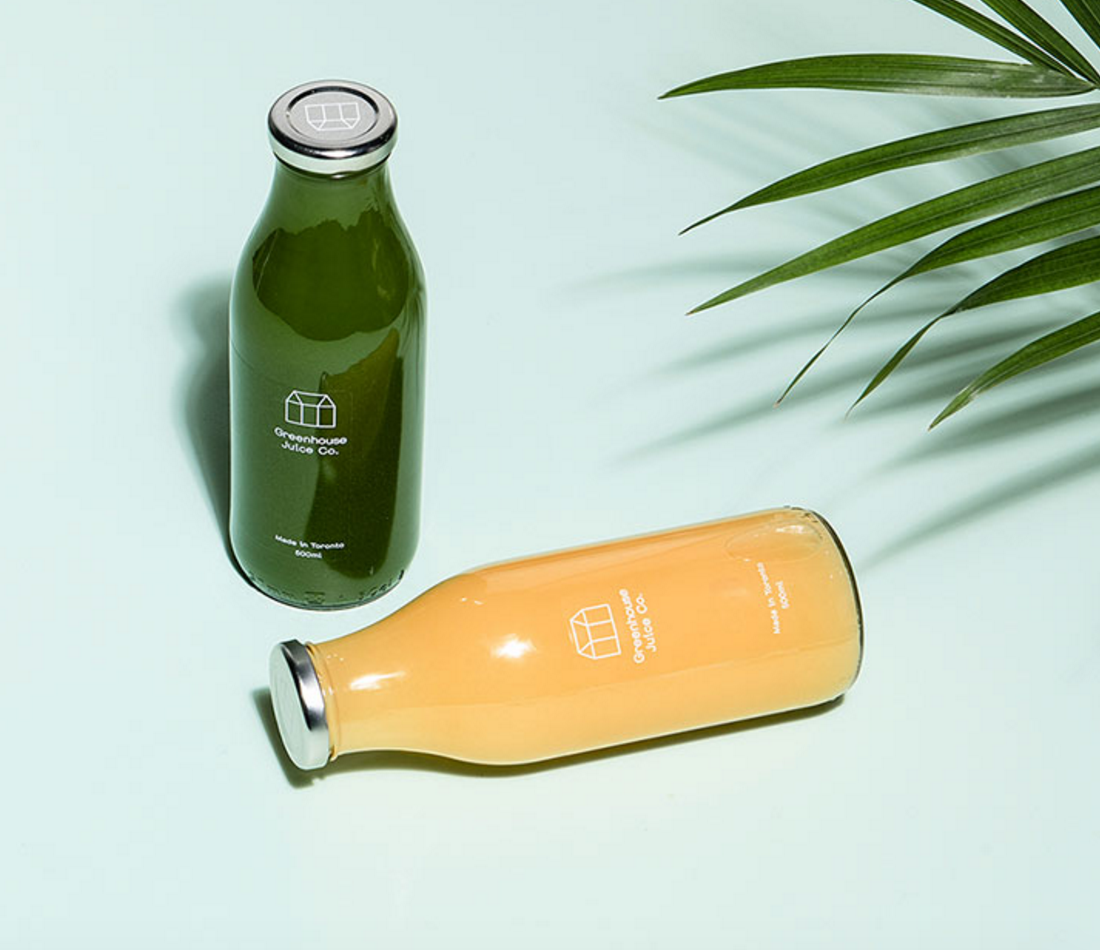
People looking for cold-pressed juice are usually looking for something fresh, tasty, and healthy. Trends in the industry lean towards minimalist styles which indicate cleanliness, as well as green and earthtones which represent a relationship with nature.
Greenhouse Juice Co. uses all of these elements to create the perfectly branded cold-pressed juice. The name make it seem as though the ingredients are all fresh and grown locally, while the symbol relies on a minimalist, geometric style which is both trendy and in-line with market expectations. And a greenhouse is not only a place where fresh food is grown, but is also transparent, implying that what you see is what you get (no funny ingredients).
Using glass bottles brings to mind milk delivery from the old days, which makes the juices feel local and personal, and glass continues the trend of transparency. You can literally see the food bits at the bottom of a new bottle, forcing you to shake it up. Shaking and popping that pressure sealed top becomes a part of the fresh experience, and forms a brain connection that you care about yourself and what you put in your body.
Conclusion
The drinks that tend stick around and become a part of the collective consciousness, becoming untouchable, even recession-proof. Popular drinks like Coca-Cola and Fanta have branding that goes beyond the actual contents in the bottle. They also are self-aware brands that go far to create the right connections with their audiences.

