How To
Beverage Packaging Design Trends in 2018
With the third quarter of 2018 approaching, some trends in beverage packaging design have already made themselves felt in the industry. We’ll look at some of the design ideas currently making their way to the shelves and helping brands stand out from the competition.
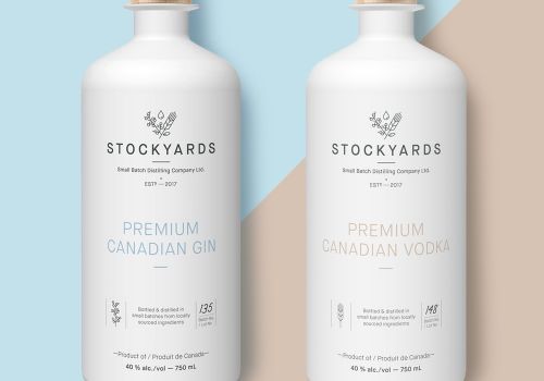 Minimalism
2018 is likely to see the trend towards more straightforward design concepts continue to grow. Minimalism is a great way to put the emphasis on the core details of a design and prioritize the design content you want to jump out at the consumer. Minimalist designs that work can get the product name and brand identity across instantly and improve brand recognition by making a design more striking in a way that sticks in the memory.
Symbolism is a critical facet of minimalist graphics because you can use a little to express a lot, and can make the difference between brands that achieve iconic status and those that don’t: the red star on Heineken drinks and the Guinness harp are two such examples of brands who use symbolism to create a deeper aura of recognition around their products.
Millennial Pink
This newly coined colour achieved rapid popularity in 2017, and it looks set to ascend even further this year.
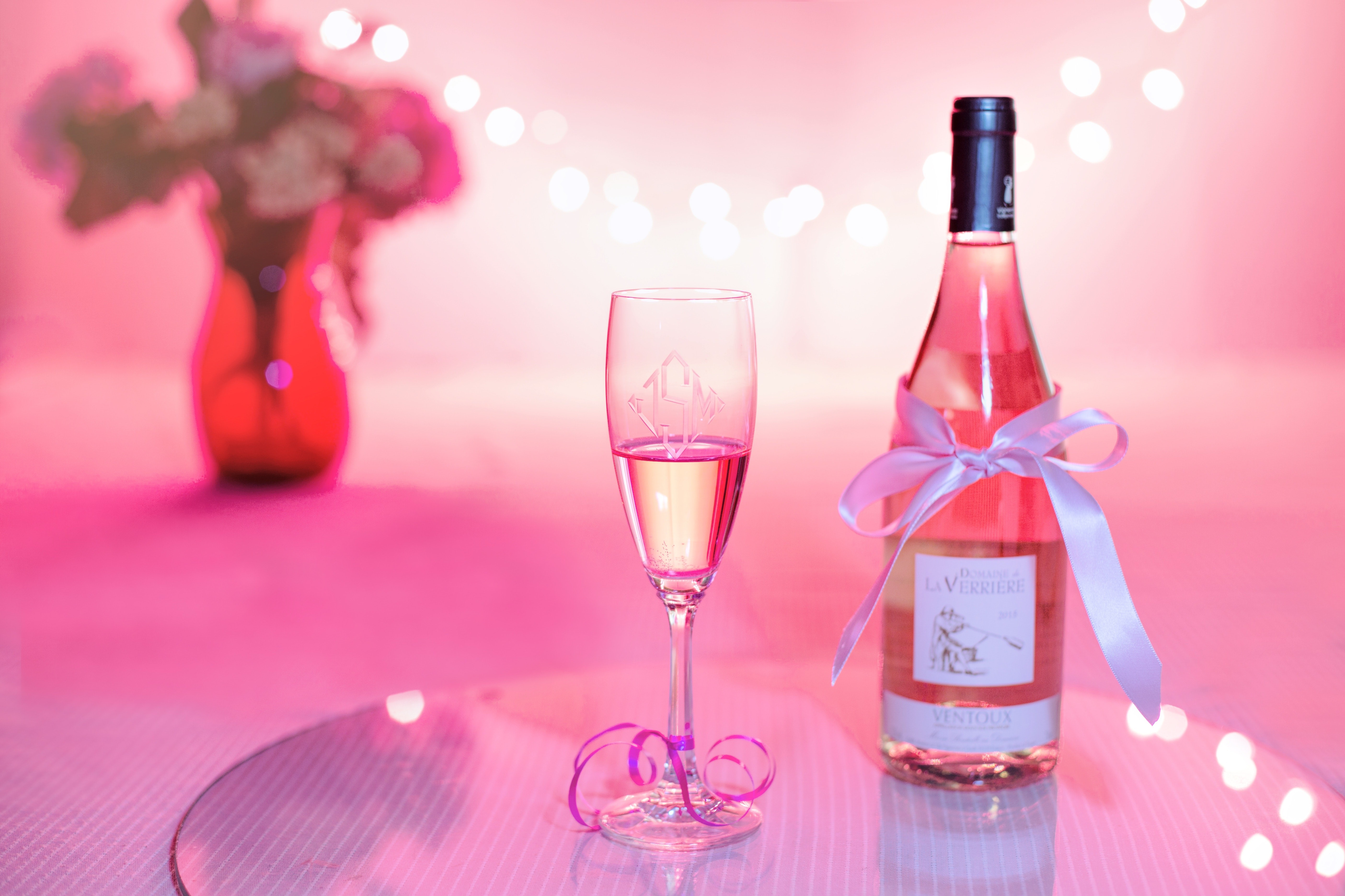
It’s gotten a lot of attention everywhere from fashion to hair color, and of course has made a big splash in the field of product packaging.
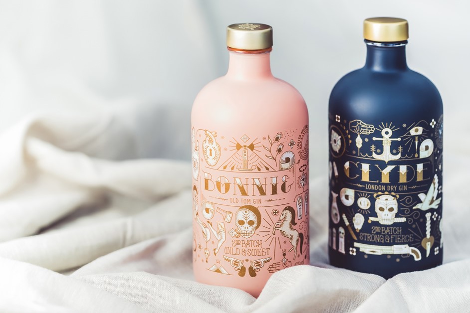
It symbolises a playful aesthetic that connects well with younger demographics and brings a lightheartedness to packaging design that catches a second glance in a way to help set a product apart from the competition.
 Pastel Tones
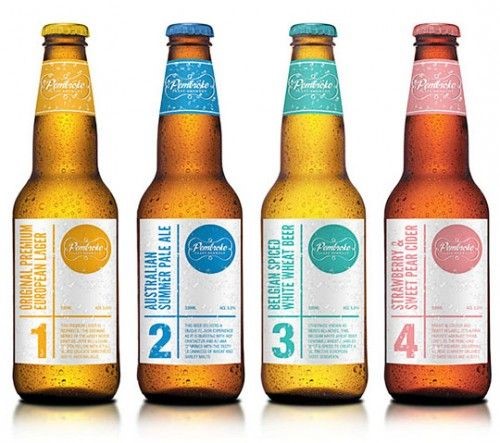
In much the same vein as millennial pink, pastel tones are informing more and more color palettes in packaging design in 2018.
They make for a breath of fresh air in a design field typically filled with the kinds of stark and bold tones that have been employed in the bottle market for so long.
Pastel tones are more calming and complementary on a package, without sacrificing their potential for incorporation into a vibrant design to provide a soothing charm without feeling cheap or disingenuous towards the consumer.
Holography
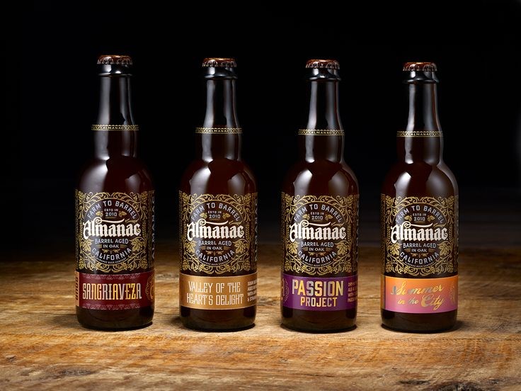 Holographic finishes are catching on with packaging designers in 2018. A holographic logo can add an extra dimension to a bottle and turn the bottle as well as just the label into a design itself. There’s an added visual impact that commands the viewer’s attention and provides more visual stimulus than what a normal label can provide. When you’re trying to make your product stand out amongst several square feet of shelf space, it’s techniques like this that can keep the gaze lingering in the critical first few seconds to visual engagement.
Contemporary Calligraphy
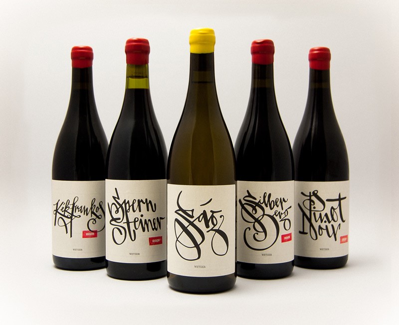 Calligraphy has been a staple of beverage packaging for quite a while, but innovations in modern calligraphy have started to filter into the drinks industry in a big way of late. Modern fonts can be given personalised tweaks to help establish individual brand identity beyond just the bottle and extend into marketing materials as well.
The Hand-lettering has proven particularly promising in this regard, allowing designers to add their own personal touches to script and play around with lettering to produce novel and distinctive styles that makes it an ideal approach to the design of packaging for products like wine bottles.
The various craft wines offered by Peter Wetzer are a great example of the kind of work possible with this design philosophy.
Sustainability
While it’s something of a buzzword in industry circles these days, sustainability can do wonders for a brand when it’s effectively incorporated into beverage packaging design.
It’s a good way to engage with consumers on an ethical level, which can forge a much more significant sense of brand engagement that you’d be hard pressed to replicate by any other means. It can also help keep costs down when it comes to manufacturing overheads.
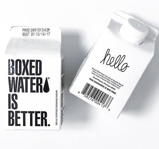
A great example of such a brand is Boxed Water, who offer consumers an eco-friendly alternative to plastic bottled water by using completely recyclable packaging distributed flat to regional filling centres allowing for a reduction in the product’s carbon footprint.
A trend is only useful when it can be effectively aligned with both brand, product and the overall ambitions of a company. It’s pointless trying to incorporate modish trends when there’s a big chasm between product and packaging, but when employed effectively, they can improve engagement with the appropriate demographics and give beverage packaging design a boost in contemporary relevance.

